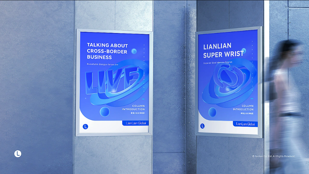
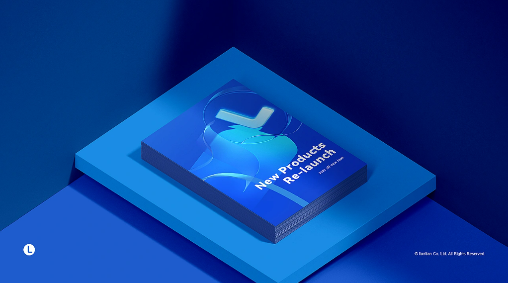
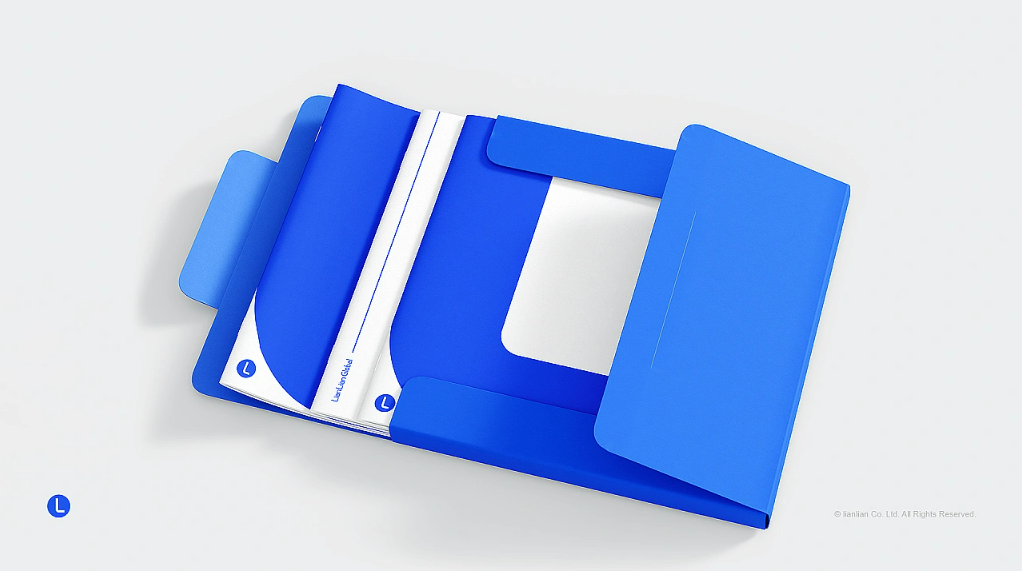
据连连国际2022年用户调研统计,20-40岁卖家群体占据总人数91.11%,连连国际正受到更多年轻卖家的青睐。
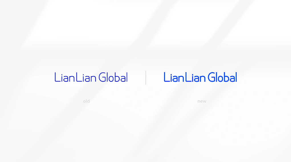
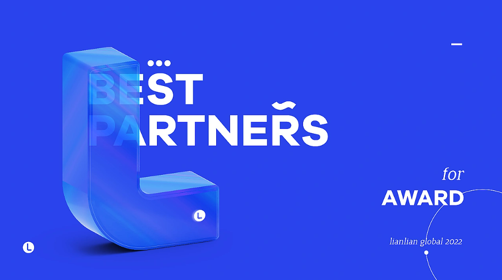
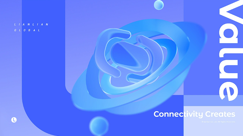
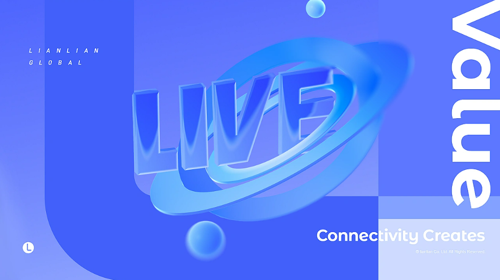
连连国际logo“L”为设计元素,赋予其“连接、向前、无限”之义,代表连连国际“通过连接无限可能,助力中国跨境
企业一往无前”的美好希冀。
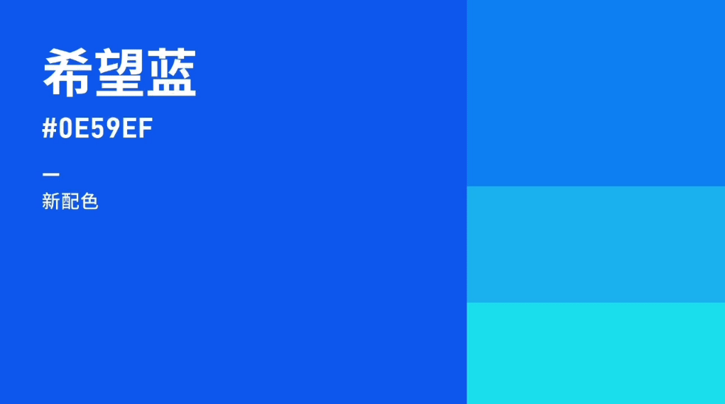
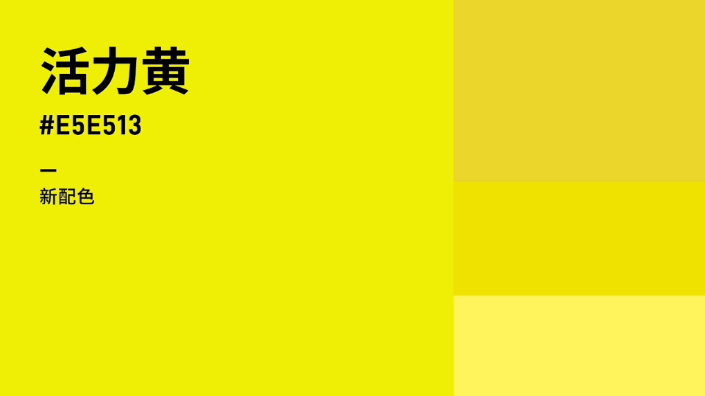
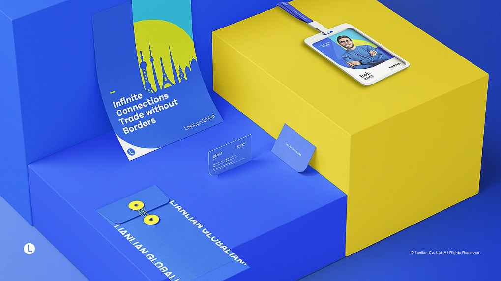
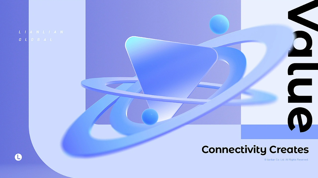
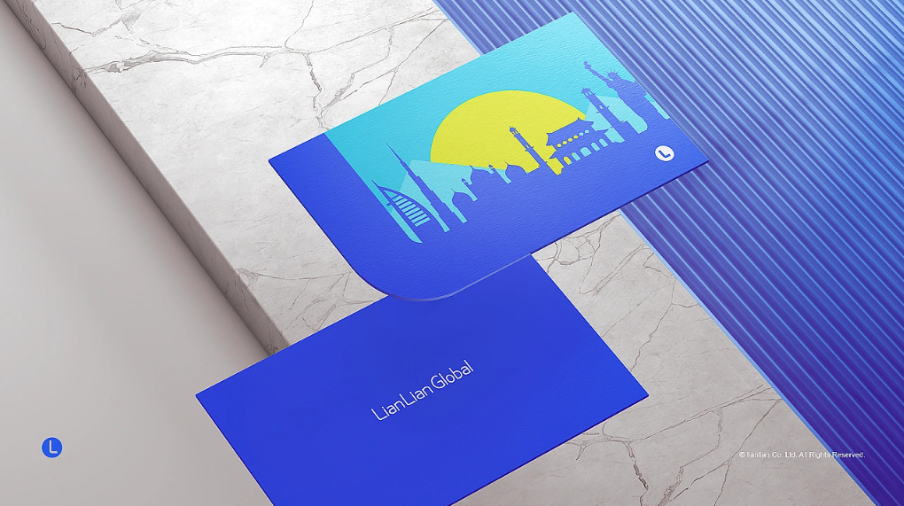
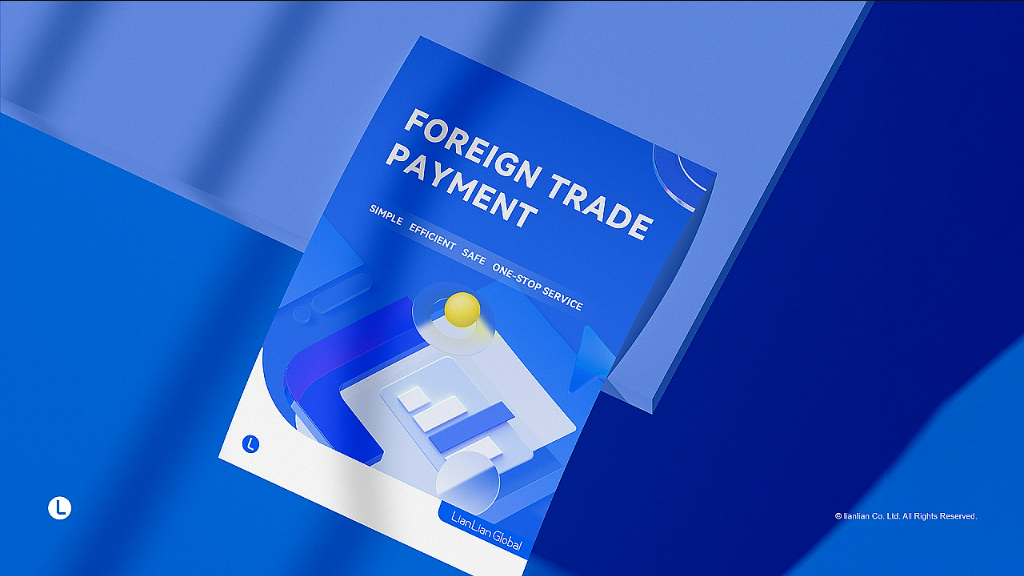
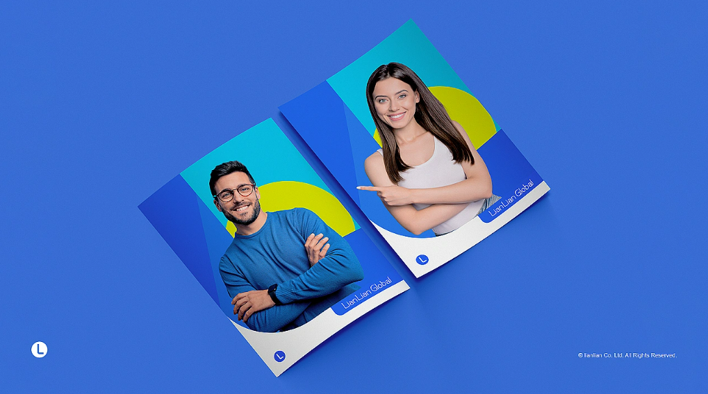
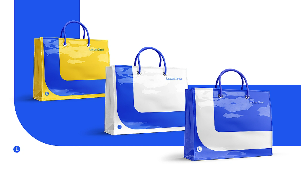
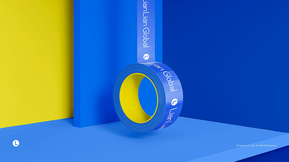
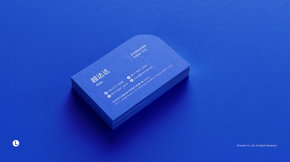
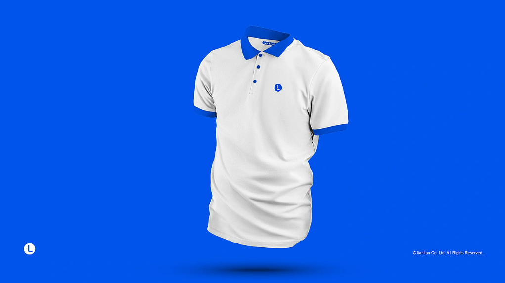
另外,在原有的品牌色上,新加入了“活力黄”和“希望蓝”为配色,以打造更年轻新潮的品牌形象。
According to LianLian global's 2022 user survey, 91.11% of the total number of sellers are between 20-40 years old,
and LianLian global is being favored by more young sellers. We took the logo "L" as the design element and gave it
the meaning of "connect, forward, infinite", representing LianLian global's "connecting infinite possibilities and
helping Chinese cross-border enterprises to go forward! It represents Lianlian International's good hope of "helping
Chinese cross-border enterprises go forward by connecting infinite possibilities".
In addition, in addition to the
original brand colors, "Vibrant Yellow" and "Hope Blue" have been added to create a more youthful and trendy brand
image.


